Bubble Symmetry: Could The NASDAQ Drop 60% And Round-Trip To 2,500?
Authored by Charles Hugh Smith via OfTwoMinds blog,
The prospect of a 60% or 80% decline in the NASDAQ index is only horrifying if we stay invested in the index all the way down.
Speculative bubbles are interesting because they’re never bubbles in real time; they’re only recognized as bubbles after they’ve popped, as we sort through the wreckage of the aftermath. Speculative bubbles are equally interesting for their uncanny display of bubble symmetry and scale invariance, two traits of manias.
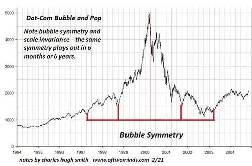
In bubble symmetry, the decline phase is the mirror-image of the manic boost phase, in both time and amplitude. For example, the NASDAQ’s dot-com bubble rose from around 1,100 in early 1997 to a peak above 5,000 in early March 2000, a rise of about 3,900 over three years.
The bubble-pop phase lasted about three years and covered a decline / round-trip back to around 1,100: a decline of about 77%. The first chart below shows the remarkable symmetry of the bubble’s ascent and collapse.
Scale invariance refers to the similarity of a 600 point bubble that arises in six months to a 6,000 point bubble that arises over 6 years: if we add a zero to the number of months (time) and the number of points (amplitude), the bubbles retain the same characteristics. Put another way, a speculative mania that lasts a week shares the same characteristics of a speculative mania that lasts a month and one that lasts a year.
Pulling back to look at the NASDAQ index from 1990 to the present, what’s striking is the modest scale of the dot-com bubble of 1997-2002. What looked like an almost unimaginably lofty peak in 2000 (5,048) now looks like a pipsqueak bubble compared to the current heights (17,032).
Also noteworthy is the time it took to reclaim the heights of the dot-com bubble. Almost 17 years passed before the index definitively topped its 2000 high of 5,048. But if we measure the purchasing power of $5,000 in 2000 and adjust for officially measured inflation from 2000 to 2018, the index had to top $7,360 to match the 2000 peak, a number it did not reach until early 2018–18 years after the peak.
Given that the index crashed back to 6,879 in March of 2020, it can be argued that the index didn’t definitively surpass the 2000 high until 2020, fully 20 years after the dot-com peak. That is a soberingly lengthy passage of time to recover the full value of cash invested at the very top of the bubble.
Now let’s project bubble symmetry on the current NASDAQ bubble. This is a FRED (St. Louis Federal Reserve) chart which doesn’t use nominal price but sets the value of the index on 2/5/1971 at 100. The basics of time duration and amplitude are essentially identical with the nominal price chart.
If the index follows the symmetry of the 2000 bubble, then we can anticipate a 60% decline by 2028 to the 2020 lows around 6,800. The full retracement of the bubble would occur by about 2032-33 with a decline to the base of the bubble, around 2,500–an 85% drop from the 2024 peak.
I’ve laid out a classic A-B-C-D pattern with a proposed narrative that tracks 1) systemic inflation and 2) the decay to zero of the Federal Reserve and Treasury’s ability to “save” the stock market with financial alchemy. I’ve made the case for sustained, systemic inflation here many times, and also made the case for diminishing returns on pumping newly issued currency into the financial system to artificially boost equities.
The prospect of a 60% or 80% decline in the NASDAQ index is only horrifying if we stay invested in the index all the way down. Those with no stake in the index will be mere observers. Since 93% of all stock ownership is concentrated in the top 10% households in the U.S., and the bottom 90% have relatively little invested directly or indirectly via pension funds and retirement funds, the full weight of this decline–which history suggests is inevitable–will fall on whomever believes such a decline is impossible and a turnaround is, well, just around the corner.
Those of us who lived through the 2000 bubbles experienced a trial run of all the emotions and market actions to come: the euphoria of easy, ever grander profits, the anxiety of the first decline, and then the swings from relief to fear as sharp recovery spikes wiped out those betting on a further decline before dropping to new lows.
If inflation is now systemic, then we can anticipate the hope-anxiety cycle will follow the “inflation is tamed / inflation is roaring back untamed” narrative. So the current peak of the happy narrative priced to perfection collapses when inflation doesn’t vanish, then recovers sharply when inflation temporarily recedes, and the the next leg down occurs when the next wave of inflation soars to new debilitating heights.
There are of course counter-arguments: stocks rise in inflationary eras, etc. There were counter-arguments in 2000 as well; many saw the first decline as a “buy the dip” opportunity, after $80 dot-com stocks fell to $40. That they would subsequently fall to $4 or $2 was not anticipated by the herd. That is of course the way bubbles pop: in fits and starts, always offering hope that the dreadful destruction of “wealth” will reverse.
We don’t control macro-dynamics or markets’ response to these dynamics. We can only choose to be observers or participants, that is, choose our exposure to risk.
* * *
Become a $3/month patron of my work via patreon.com. Subscribe to my Substack for free
Tyler Durden
Sat, 06/01/2024 – 15:10


Share This Article
Choose Your Platform: Facebook Twitter Linkedin